Bernard Brace
Accountants
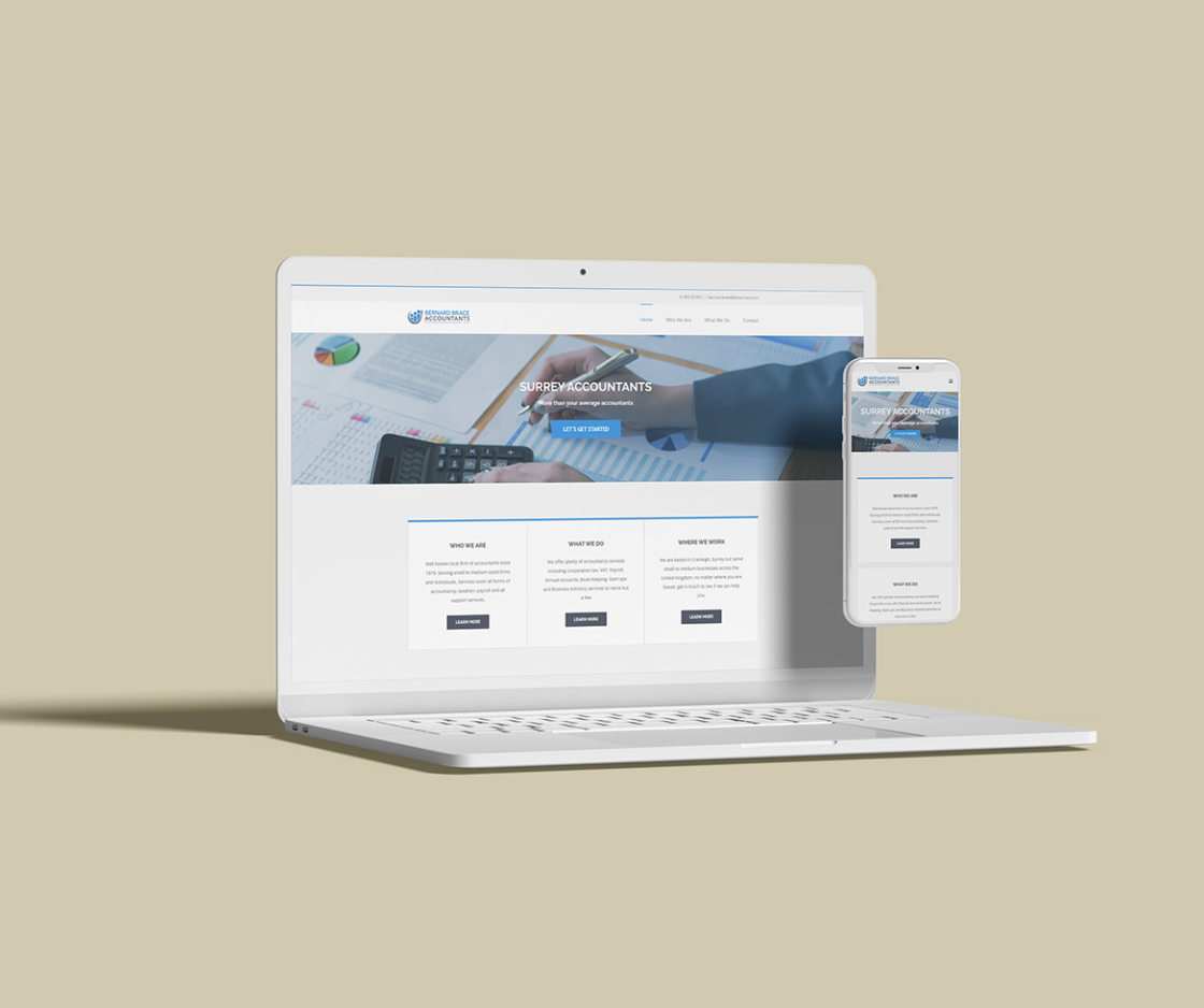
A rebrand and engaging new website for an established chartered accountancy firm, giving their online presence the professional boost it deserved with team photography and clear service presentation.
Keeping the Books
Looking Sharp
After completing a rebrand for Bernard Brace Accountants, we were tasked with translating that refreshed identity into a modern digital presence. The people-icon logo mark communicates approachability and teamwork, while the bold blue palette projects trustworthiness and financial expertise.
A clean, modern sans-serif reflects the firm's professional standards while remaining approachable. The bold weights in headings command authority, while lighter body text ensures comfortable reading.
People-First Logo
The three-figure icon represents the teamwork and personal service at the heart of BBA. It communicates that behind the numbers are real people dedicated to their clients' financial wellbeing.
Trust-Building Blue
Blue is the colour of trust and reliability in financial services. The rich primary blue establishes credibility while lighter accents keep the design feeling modern and accessible rather than stuffy.
Professional Online,
Approachable In Person
An engaging, easy-to-use responsive website that helps prospective clients discover what Bernard Brace Accountants does and makes it simple to get in touch.
Want a website like this?
Whether you need a complete rebrand, a professional website, or both, we would love to hear about your project.
Ready to Start Your Project?
Let's create something extraordinary together.
Get In Touch →